
Company
Iconscout
My Role
Visual Designer
Responsabilities
Overview
As a Visual Designer, I led the rebranding initiative for IconScout, a digital asset marketplace that provides icons, illustrations, animations, and 3D assets to creatives worldwide. The goal was to redefine IconScout’s visual identity to better reflect its evolution, align with modern design sensibilities, and appeal to a diverse user base of designers, developers, and businesses. The rebranding involved updating the logo, color palette, typography, and overall brand language while maintaining its core essence and recognition.
Initial Challenges
The rebranding effort faced several challenges:
Legacy Recognition: Preserving the brand’s existing identity and user recognition while introducing a fresh look.
Unified Visual Language: Establishing a cohesive visual identity across all touchpoints, including the website, mobile app, and marketing materials.
Diverse User Base: Catering to a wide range of users with varying preferences and needs.
Scalability: Creating a flexible design system that could scale with future expansions and product offerings.
Research & Brand Immersion
The research phase was critical in shaping the rebranding strategy:
User Insights: Conducted surveys and interviews with existing users to understand their perception of the brand and expectations from the rebrand.
Competitive Analysis: Analyzed competitors in the digital asset marketplace to identify opportunities for differentiation.
Brand Workshops: Collaborated with internal stakeholders to align on the brand’s mission, vision, and values.
Design Audit: Reviewed existing assets and touchpoints to identify inconsistencies and areas for improvement.
Execution & Strategy
The rebranding process was executed in phases:
1. Logo Redesign:
Designed a modern, minimalistic logo that retained elements of the original to maintain brand recognition.
Incorporated subtle design elements that symbolized creativity, community, and scalability.
2. Visual Identity System:
Color Palette: Introduced a vibrant yet professional color scheme to evoke creativity and trust.
Typography: Selected modern, legible typefaces to enhance readability and brand sophistication.
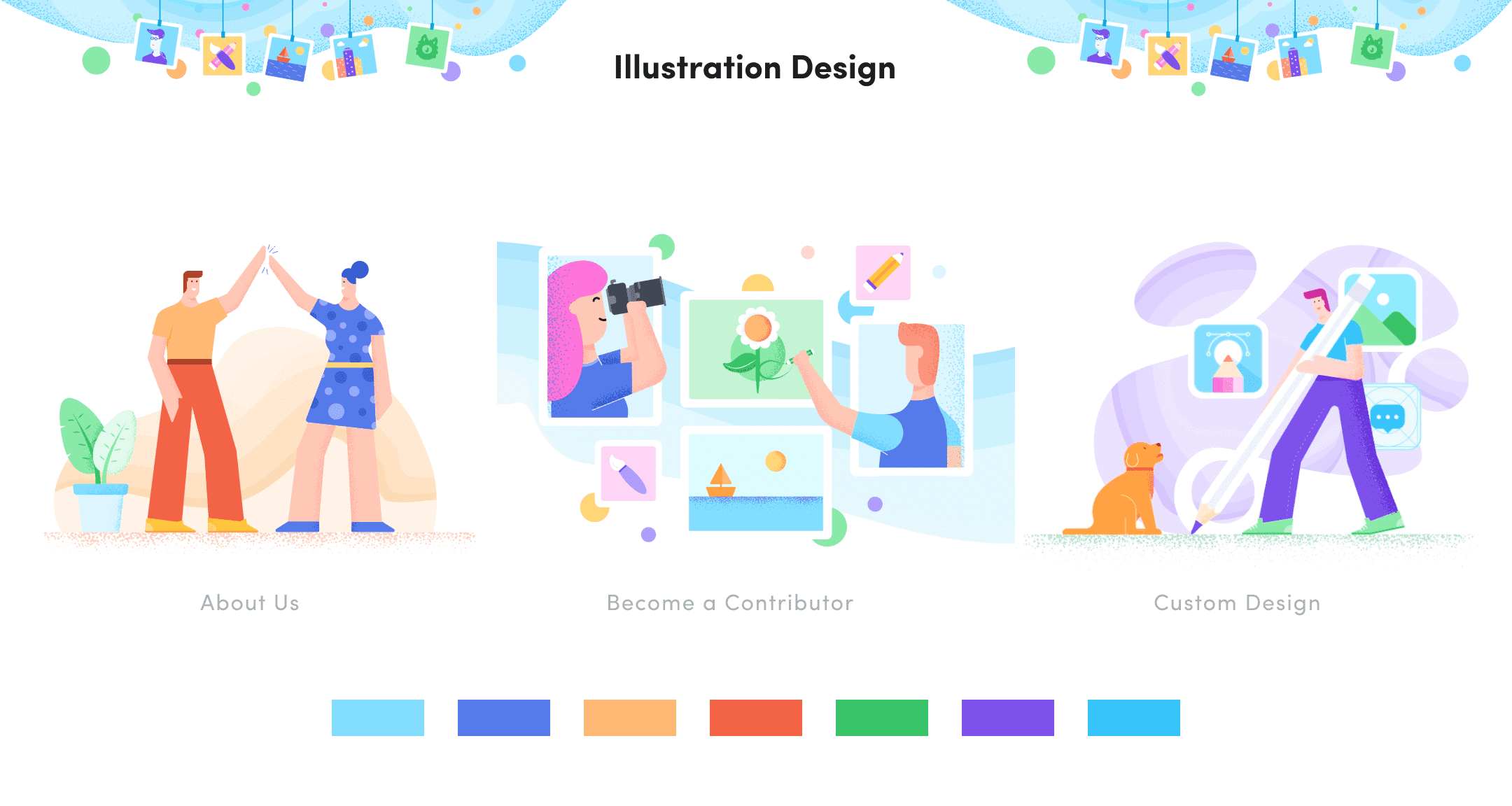
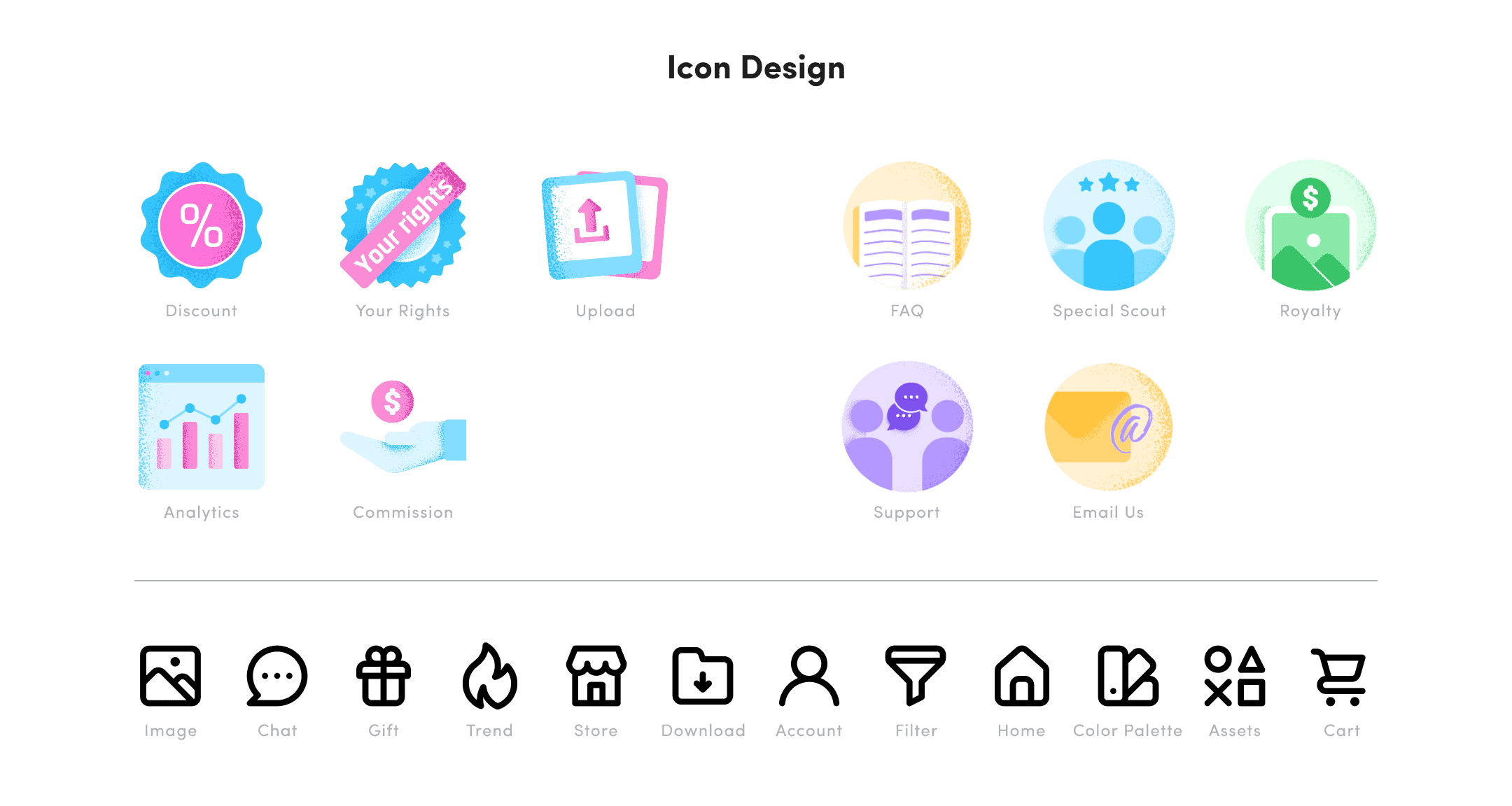
Iconography: Updated the style of icons to align with the new visual language, ensuring consistency across all assets.
3. Design System:
Developed a comprehensive design system, including guidelines for UI components, illustrations, animations, and marketing collateral.
Created templates and reusable components to streamline design workflows.
4. Cross-Platform Implementation:
Applied the new visual identity across the website, mobile app, and marketing materials.
Worked closely with developers to ensure accurate implementation of the design system.
5. Communication Strategy:
Crafted a launch campaign to introduce the rebrand to users, highlighting the rationale and benefits.
Created promotional content, including blog posts, social media updates, and email campaigns.
The Impact
The rebranding effort faced several challenges:
Legacy Recognition: Preserving the brand’s existing identity and user recognition while introducing a fresh look.
Unified Visual Language: Establishing a cohesive visual identity across all touchpoints, including the website, mobile app, and marketing materials.
Diverse User Base: Catering to a wide range of users with varying preferences and needs.
Scalability: Creating a flexible design system that could scale with future expansions and product offerings.